
So far in this series showing the capabilities of native Streamlit apps in Snowflake, I’ve created an app to display “Hello, world!”, connected to Snowflake to show session info and return query results in a data frame. Now I’ll add some additional functionality to format my app layout in columns and add two selection boxes to add filters to some sample data.
Creating Sample Data
When creating a trial Snowflake account Snowflake provides some sample data to “play” with and test the capabilities of Snowflake. I’ll use the provided sample data to create a view for my app. To keep things tidy, I’ll also create a new schema for my Streamlit data and then create a view in that schema to show annual sales (in millions of dollars) per country per region from the sample data.
STREAMLIT_DATA Schema Setup
First, I’ll need to set up my new schema and grant usage on that schema to the role that runs the app, ST_DEMO_ROLE.
USE DATABASE STREAMLIT_DB;
CREATE SCHEMA STREAMLIT_DATA;
GRANT USAGE ON SCHEMA STREAMLIT_DATA TO ROLE ST_DEMO_ROLE;
VW_SALES_DATA View Setup
Next, I’ll use some of the Snowflake sample data to create a view to summarize the sales data by year by region, and country. I use grouping sets to a total, or “ALL” countries value.
USE SCHEMA STREAMLIT_DB.STREAMLIT_DATA;

CREATE OR REPLACE VIEW VW_SALES_DATA AS
SELECT
    YEAR(O.O_ORDERDATE) AS ORDER_YEAR,
    R.R_NAME AS REGION_NAME,
    N.N_NAME AS COUNTRY_NAME,
    SUM(O.O_TOTALPRICE) AS TOTAL_SALES
FROM
    SNOWFLAKE_SAMPLE_DATA.TPCH_SF1.ORDERS as o
JOIN
    SNOWFLAKE_SAMPLE_DATA.TPCH_SF1.CUSTOMER AS c
ON
    o.O_CUSTKEY = c.C_CUSTKEY
JOIN
    SNOWFLAKE_SAMPLE_DATA.TPCH_SF1.NATION as N
ON
    C.C_NATIONKEY = N.N_NATIONKEY
JOIN
    SNOWFLAKE_SAMPLE_DATA.TPCH_SF1.REGION as R
ON
    N.N_REGIONKEY=R.R_REGIONKEY
GROUP BY
    GROUPING SETS(
        (YEAR(O.O_ORDERDATE),R.R_NAME,N_NAME),
        (YEAR(O.O_ORDERDATE),R.R_NAME)
    );

Using Column Layouts
Streamlit provides several formatting options as standard functions, one of which is columns that can be set up by using st.columns(). By using st.columns, I can define co1 and col2 as variables and then reference those in my Python script to add additional Streamlit objects to them. In this case, I’ll add one selection box to each column – one on the left for a region selector, and one on the right for a country selector. The values for each selection box will come from the VW_SALES_DATA view. Additionally, the country selection box will be filtered based on the selection of the region box through the use of the Python string formatting.
Data Selection Boxes
In the code block below, I use st.columns to define my two columns, and then using “with” syntax, I define the SQL, data frame, and select box for each column. In the country column, I use the region_name variable from the first select box to update my WHERE clause in the country SQL statement (see highlighted lines).
 #ADD SOME COLUMNS FOR SELECTION BOXES
col1,col2 = st.columns(2)

#COL1 = REGION
with col1:
    region_sql ="""
    SELECT
        REGION_NAME
    FROM
        STREAMLIT_DATA.VW_SALES_DATA
    GROUP BY
        REGION_NAME
    ORDER BY
        REGION_NAME;
    """
    region_df = session.sql(region_sql).collect()
    region_name = st.selectbox("Choose a region:",options=region_df)

#COL2 = COUNTRY
with col2:
    country_sql=f"""
    SELECT
        COALESCE(COUNTRY_NAME,'ALL') AS ST_COUNTRY_NAME
    FROM
        STREAMLIT_DATA.VW_SALES_DATA
    WHERE
        REGION_NAME = '{region_name}'
    GROUP BY
        COUNTRY_NAME
    ORDER BY
        COUNTRY_NAME ASC NULLS FIRST;
    """
    country_df = session.sql(country_sql).collect()
    country_name = st.selectbox("Choose a country:",options=country_df)

Customizing st.columns()
In the code above, st.columns() generates two columns of equal width in the app; however, I can also specify the relative width of each column to one another. In the code block below, I create two new column variables prefixed with “r2” to indicate row 2 of the app and specify that the relative width of column 2 is four times the width of column 1. For additional information on column setup, please see the Streamlit documentation.
r2col1,r2col2 = st.columns([1,4])
Bar Chart Data Setup
To display a bar chart as well as a data frame to show the underlying data, I’ll first need to query the VW_SALES_DATA view and apply the filters specified in the region and country select boxes. In the query, I am adding a row_number for the data index as well as converting the sales numbers into millions of dollars – primarily to keep the numbers smaller for screen output.
In step three of the code block below, I am converting the Snowpark data frame to a Pandas data frame, setting the index as well, and defining the column names. This step is done to help simplify the bar chart creation. I found during testing that the native Snowpark data frame would work, but calling the columns by name in the axis labels caused some odd behavior. Pandas worked better for the demo. Speaking of Pandas, I also added an import for Pandas at the top of my app.
#IMPORT STREAMLIT LIBRARY
import streamlit as st
#IMPORT SNOWPARK SESSION
from snowflake.snowpark.context import get_active_session
#IMPORT PANDAS
import pandas as pd
I also introduce some additional data type conversion methods for Pandas data frames as part of this code. While not 100% necessary, I did so to force the data values to what I wanted them to be for display on the charts.
#BUILD A BAR CHART
#STEP 1: BUILD SQL - SALES IN MILLIONS BY YEAR,INCLUDE AN INDEX COLUMN FOR CHART BUILDING
sql_bar_chart = f"""
SELECT
    ROW_NUMBER() OVER (ORDER BY ORDER_YEAR) AS DF_IDX,
    ORDER_YEAR,
    ROUND((TOTAL_SALES / 1000000),3)::NUMERIC(19,3) as SALES_IN_MILLIONS
FROM
    STREAMLIT_DATA.VW_SALES_DATA
WHERE
    REGION_NAME = '{region_name}'
    AND
    COALESCE(COUNTRY_NAME,'ALL')='{country_name}'
ORDER BY
    DF_IDX
"""
#STEP 2: COLLECT THE DATAFRAME
bar_chart_df = session.sql(sql_bar_chart).collect()
#STEP 3: CONVERT TO A PANDAS DATAFRAME
bar_pandas_df = pd.DataFrame(bar_chart_df,columns=["DF_IDX","ORDER_YEAR","SALES_IN_MILLIONS"]).set_index("DF_IDX")
#STEP 4: CONVERT TO PROPER DATATYPES
bar_pandas_df = bar_pandas_df.astype({"ORDER_YEAR": "object","SALES_IN_MILLIONS":"float"})
Display the Chart Data Frame
In the first column, I want to display the underlying data for my chart. As I’ve shown in a previous post, displaying a data frame or data grid in Streamlit is just a couple of lines of code:
with r2col1:
    #STEP 6: SHOW UNDERLYING DATA
    st.subheader("Underlying Chart Data")
    st.dataframe(data=bar_pandas_df)
Display the Bar Chart
Just like most other things in Streamlit, adding a bar chart is pretty straightforward and only needs a single function st.bar_chart(). For this example, I’ll set the year on the x-axis and the sales in millions on the y-axis. In the Streamlit documentation, st.bar_chart() also supports a “color” parameter to set the color palette of the chart. As of this writing, the color parameter is not supported in native Streamlit apps in Snowflake.
 with r2col2:
    #STEP 5: CREATE THE CHART
    st.subheader("Total Sales (in Millions) by Year")
    st.bar_chart(data=bar_pandas_df,x="ORDER_YEAR",y="SALES_IN_MILLIONS")
Final App Presentation
Now that I’ve added all the code, I can run my app and see how it lays out on the screen.
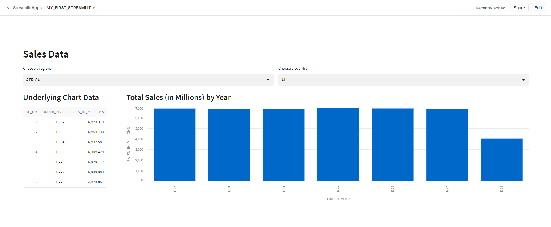
As I change the selected values in the select boxes, the app queries the data, displays it to the screen in the data frame, and updates the bar chart. Behind the scenes, with each change, the app is re-running, so each change executes the proper SQL commands against Snowflake. In other non-native Streamlit apps, I could use st.cache to load the underlying data into data frames first and add them to our app cache. From there, the changes to the select boxes would then filter the data frames loaded in the cache to update the app. At this time st.cache is unsupported in native Streamlit apps in Snowflake. For a full list of unsupported features, see the Snowflake Documentation.
Wrapping Up
In this article, I walked through creating a simple bar chart from some of the sample Snowflake Data provided with a trial account. The demo shows just how easy it is to make an app in Snowflake with Streamlit. There are still some limitations to the native apps, but it wouldn’t surprise me if many of the unsupported features become supported features soon.

One thought on “Snowflake: Bar Chart in Native Streamlit”