
In my last article, I showed how to create a simple bar chart in a Native Streamlit app in Snowflake. It works great for simple bar charts. What if I wanted to see the breakdown of parts sales by manufacturer by country/region from the previous example? A stacked bar chart with each manufacturer having a different color would be ideal, and according to the st.bar_chart documentation the “color” parameter should do this nicely; however, the “color” parameter isn’t supported in a native Streamlit app yet (as of the writing of this article).
Looking more closely at the st.bar_chart documentation a little more closely, I saw the following:
This is syntax-sugar around st.altair_chart. The main difference is this command uses the data’s own column and indices to figure out the chart’s spec. As a result this is easier to use for many “just plot this” scenarios, while being less customizable.
https://docs.streamlit.io/library/api-reference/charts/st.bar_chart
If st.bar_chart does not guess the data specification correctly, try specifying your desired chart using st.altair_chart.
So, st.bar_chart is just a slick wrapper for st.altair_chart, which opens up a world of options for the charts – and can handle the specifics of the stacked bar chart I wanted to see. Be sure to import the Altair library in the Steamlit app code.
#IMPORT STREAMLIT LIBRARY
import streamlit as st
#IMPORT SNOWPARK SESSION
from snowflake.snowpark.context import get_active_session
#IMPORT PANDAS
import pandas as pd
#IMPORT ALTAIR
import altair as alt
Update the Data View
First, I’ll need to update my underlying view in the STREAMLIT_DATA schema to include the manufacturer of the part for the orders by year, country, and region. Additionally, I’ll need to adjust my grouping sets to ensure the proper groups are being calculated for the charts. To get the manufacturer’s name, I had to add the LINEITEM and PART tables to the query; adding the appropriate columns and groups as needed.
CREATE OR REPLACE VIEW VW_SALES_DATA AS
SELECT
    YEAR(O.O_ORDERDATE) AS ORDER_YEAR,
    R.R_NAME AS REGION_NAME,
    N.N_NAME AS COUNTRY_NAME,
    P.P_MFGR AS PART_MFG,
    SUM(L.L_EXTENDEDPRICE) AS TOTAL_SALES
FROM
    SNOWFLAKE_SAMPLE_DATA.TPCH_SF1.ORDERS as o
JOIN
    SNOWFLAKE_SAMPLE_DATA.TPCH_SF1.CUSTOMER AS c
ON
    o.O_CUSTKEY = c.C_CUSTKEY
JOIN
    SNOWFLAKE_SAMPLE_DATA.TPCH_SF1.NATION as N
ON
    C.C_NATIONKEY = N.N_NATIONKEY
JOIN
    SNOWFLAKE_SAMPLE_DATA.TPCH_SF1.REGION as R
ON
    N.N_REGIONKEY=R.R_REGIONKEY
JOIN
    SNOWFLAKE_SAMPLE_DATA.TPCH_SF1.LINEITEM AS L
ON
    O.O_ORDERKEY = L.L_ORDERKEY
JOIN
    SNOWFLAKE_SAMPLE_DATA.TPCH_SF1.PART AS P
ON
    L.L_PARTKEY = P.P_PARTKEY
GROUP BY
    GROUPING SETS(
        (YEAR(O.O_ORDERDATE),R.R_NAME,N_NAME,P.P_MFGR),
        (YEAR(O.O_ORDERDATE),R.R_NAME,P.P_MFGR)
    );
Update Streamlit Data Frames
With the underlying data view updated as needed, I’ll need to update the data frames in the Steamlit app to include the new column for the manufacturer. In MY_FIRST_STREAMLIT.py, I’ll add “PART_MFG” to the query and then add “PART_MFG” to the pandas data frame.
#STEP 1: BUILD SQL - SALES IN MILLIONS BY YEAR,INCLUDE AN INDEX COLUMN FOR CHART BUILDING
sql_bar_chart = f"""
SELECT
    ROW_NUMBER() OVER (ORDER BY ORDER_YEAR) AS DF_IDX,
    ORDER_YEAR,
    PART_MFG,
    ROUND((TOTAL_SALES / 1000000),3)::NUMERIC(19,3) as SALES_IN_MILLIONS
FROM
    STREAMLIT_DATA.VW_SALES_DATA
WHERE
    REGION_NAME = '{region_name}'
    AND
    COALESCE(COUNTRY_NAME,'ALL')='{country_name}'
ORDER BY
    DF_IDX
"""
#STEP 2: COLLECT THE DATAFRAME
bar_chart_df = session.sql(sql_bar_chart).collect()
#STEP 3: CONVERT TO A PANDAS DATAFRAME
### ORIGINAL DATAFRAME ###
#bar_pandas_df = pd.DataFrame(bar_chart_df,columns=["DF_IDX","ORDER_YEAR","SALES_IN_MILLIONS"]).set_index("DF_IDX")

### UPDATED DATA FRAME###
bar_pandas_df = pd.DataFrame(bar_chart_df,columns=["DF_IDX","ORDER_YEAR","PART_MFG","SALES_IN_MILLIONS"]).set_index("DF_IDX")
#STEP 4: CONVERT TO PROPER DATATYPES
### ORIGINAL ###
#bar_pandas_df = bar_pandas_df.astype({"ORDER_YEAR": "object","SALES_IN_MILLIONS":"float"})

### UPDATED ###
bar_pandas_df = bar_pandas_df.astype({"ORDER_YEAR": "object","SALES_IN_MILLIONS":"float","PART_MFG":"object"})
Stacked Bar Chart with Altair Chart
Using st.altair_chart to build the stacked bar chart is a relatively easy conversion given that most of the work for this example is done in Snowflake SQL and the Pandas data frame already. The st.altair_chart has a lot more customization that can be applied for each element – for example, setting the axis titles or setting a specific range on the axis scale. Both Streamlit and Altair have good documentation on all the options available.
Building the Chart
Unlike using st.bar_chart, I had to first build a chart object to use st.altair_chart. Inside the chart object is where I specified things like the data frame to use, the x and y-axis data and labels as well as which column determined the color.
#CREATE THE ALTAIR CHART DATA
    chart = alt.Chart(bar_pandas_df).mark_bar().encode(
        x = alt.X("ORDER_YEAR",title="ORDER YEAR",type="nominal")
       ,y=alt.Y("SALES_IN_MILLIONS",title="SALES IN MILLIONS")
        ,color= alt.Color("PART_MFG",title="PARTS MANUFACTURER")
    )

st.altair_chart(chart,use_container_width=True,theme="streamlit")
In the code block above, each element of the chart is specified with a function call from the Altair library. Each element has good documentation on the Altair site to further explain all the options. After building the chart object, I added the object to my app with st.altair_chart. Notice, I set the chart to use its container width to fill the column as well as set the theme to “streamlit”. By setting the theme option to Streamlit, the “look and feel” of the chart matches other elements of a Streamlit app. Otherwise, the theme would default to the Altair settings.

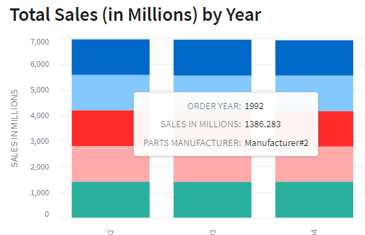
Running the app now shows the sales data with a stacked bar chart with different colors representing each manufacturer in the overall total. Hovering over one of the bar colors will show a pop-up of the data point being plotted.
Conclusion
Plotting a chart in a Native Streamlit app in Snowflake can be a very effective way to visualize your data for consumption. Some of the more simple options like st.bar_chart do a good job with simple data, but to harness the power of some more complicated charts, look to st.altair_chart as there are a lot more chart types available and the configurations options are much more detailed.

One thought on “Snowflake: Stacked Bar Chart in Native Streamlit”