
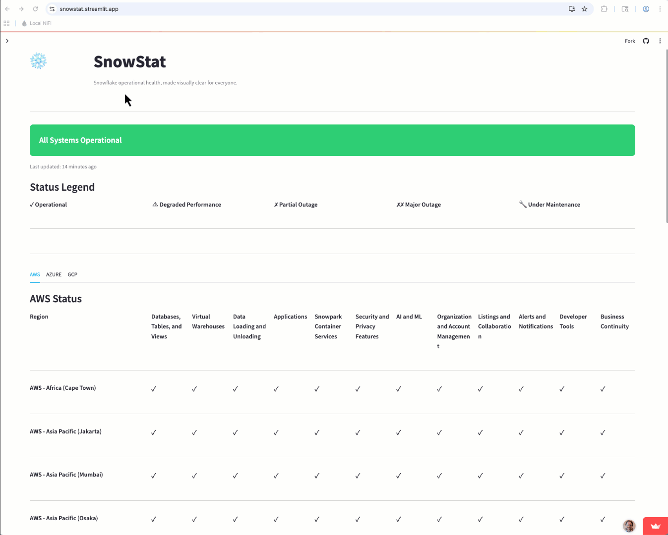
Introducing SnowStat: Snowflake operational health, made visually clear for everyone.
TL;DR: I rebuilt the Snowflake status page as a single‑page Streamlit app with icon‑first indicators. It’s fast to scan, friendly for colorblind users, and faithful to the original layout.
The Problem, Briefly
I’m partially colorblind – particularly around blues/purples and greens/browns. It’s a running joke in my family as my kids like to ask me the colors of things and giggle as I am apparently wildly inaccurate!
As a Snowflake Solution Engineer, when an incident happens, I don’t have time to decode subtle color differences across clouds, regions, and services to support my customers. I need “at‑a‑glance truth”—clear icons, consistent placement, and predictable structure—so I can tell what’s happening now without squinting.
Armed with an idea and my new favorite coding IDE, Cursor, I set out to build my idea. Total build time was just a few hours from scratch, including many, many revisions to fine tune and tweak my prompts and bring my idea to reality.
What I Built
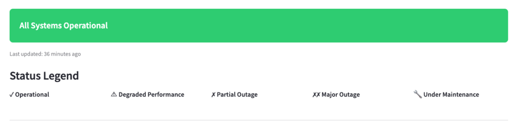
A single‑page Streamlit app that mirrors the official status experience but makes it easier to parse:
- Icon‑first indicators with readable labels
- Region rows × Service columns, ordered to match the official site
- Always‑visible legend and tooltips (status + component name + last update)
- Auto‑refresh (1–10 minutes), defaulting to icon mode
It shows the same information you’d expect—global health, cloud tabs, and the matrix—just presented for fast, reliable scanning.
Design Principles
I wanted to stay true to the original status page layout so users didn’t have to learn a new motion. Aside from the the cloud regions in SnowStat being in alphabetical order, the layout is the same as the main status page. This is likely a future enhancement to match region orders as well.
How It Works
Snowflake makes the status data available via a public API for integration into other systems, so naturally it was a great place to start. The Streamlit app connects to these APIs to gather the current status for each cloud provider and service and then converts the raw data into the easy-to-read matrix.
One difference from the official status page are the status indicator tool tips. Hover over an icon to details on the status, which component you’re on, and the last updated timestamp.
Closing
They say necessity is the mother of invention and when a major cloud provider had an outage that impacted my customers recently, I needed a quick way to find the status of their Snowflake accounts. I can more easily scan icons than colors, so the idea for SnowStat was born. Now I have a tool that leverages the official Snowflake status data, but presents it in a way that increases my productivity.
- Try SnowStat on Streamlit Community Cloud: https://snowstat.streamlit.app
- Check out the Git Repo: https://github.com/sfc-gh-eheilman/snowstat
Follow me on LinkedIn and Medium for more data engineering and AI demos on Snowflake, Streamlit, and Python.
